Portfolio Lineup
Many designs are made in the tryouts, but not all survive the final cut. Here are some various prospects I’ve produced that made the team and others that did not. When creating for a client or a contest, sometimes you hit a home run and other times you strike out. Whether it’s an initial hit, foul ball or whiff, the main thing is that you keep taking your swings. Working through the process to find a solution is important. Many thanks go to my parents for encouraging my art from the start and to always play hard!


























Scouting Report
I love designing logos! Here’s how I make a new mark. In the the beginning innings, information is gathered about the client and research is done to think of any elements the new logo might need to represent the concept concisely. I then fill up sheets of paper with black ink thumbnail sketches and exhaust the possibilities. Anything goes at this brainstorming stage and it is the part of the process that I enjoy most. The middle innings involve picking ideas that have potential and then constructing them on the computer by tightening up the typography and any visual elements being used. Color is now also added to further enhance the look of the logo. These polished up design comps are then presented to the client. After receiving feedback about the chosen identity idea to be further developed, the later innings include the revisions and refinements that get worked out before the final art files of the new logo are made. Branding and application aspects of the emerging logo can then be implemented to consistently reinforce the look of the total identity package.
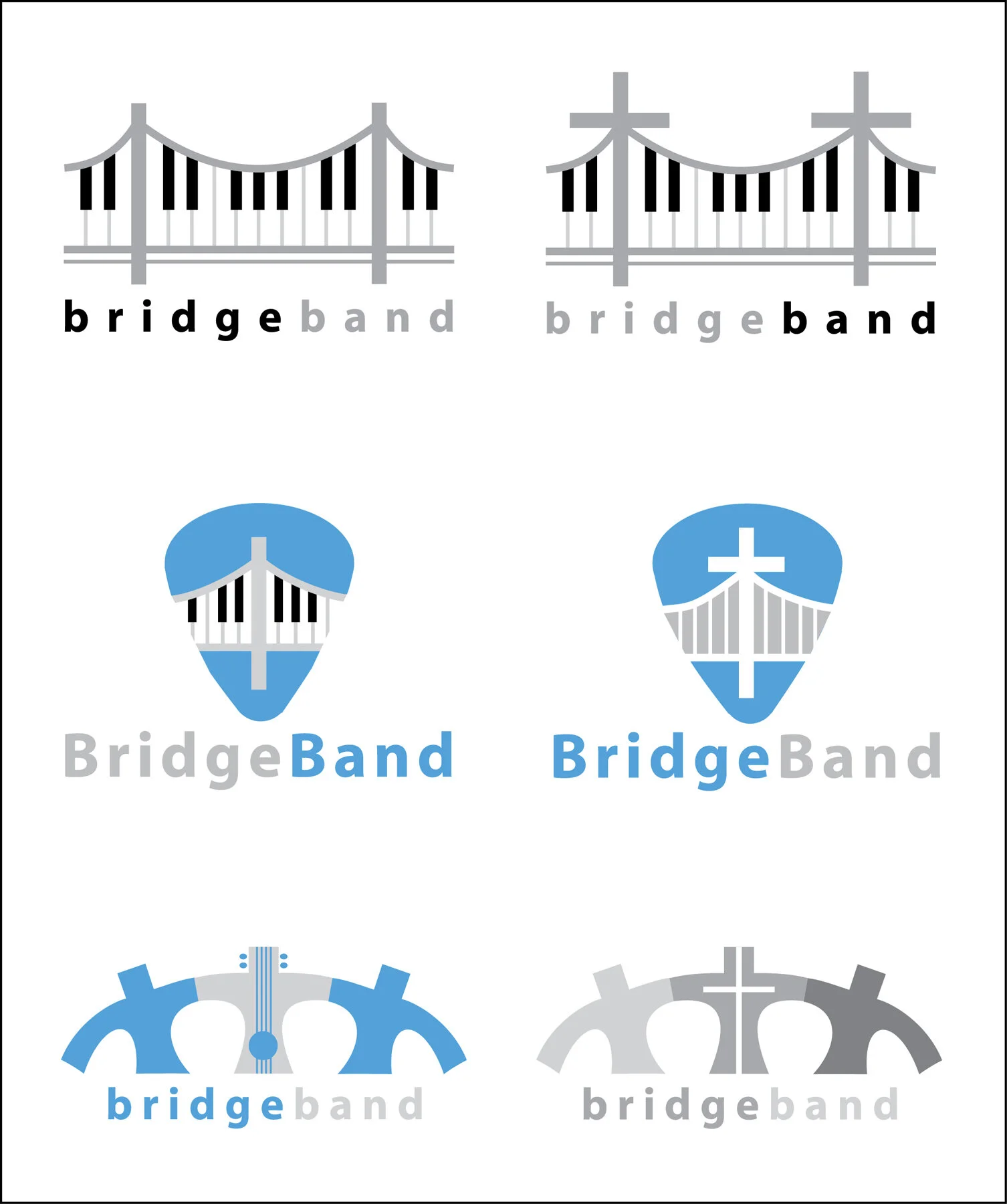
In the case study example below, the client was a band specializing in church and gospel music, plus popular oldies and folk songs. A cross was also incorporated into each design style as an alternative, just in case it was an extra element that the band wanted to help further build their image. As it turns out it was and as you can see, the final design on the business card below was very similar to the design in the next to last row on the far left of the thumbnail sketches. As a visual communicator, I have to be able recognize what ideas have potential and then further develop and present them in a confident and positive way. I had an “aha” moment when I added the piano keys to the suspension bridge cables and knew I had the potential solution when they worked together so easily. What I enjoy most about making a new logo is solving a visual puzzle using uncommon elements that unite in an unexpected and eye pleasing way to convey the message of the mark.
Thumbnail Sketches
Computer Sketches
Business Card
The business card features the final logo on a black background. It includes the name of all three band members on it, however, only one phone number is needed to book gigs. This was an effective and efficient solution.


